Coming into this New Year, I’m thinking about the blue humanities. That’s not unusual, I suppose, since I’ve been thinking about little else for the past decade, but my plan is to concentrate in 2021.

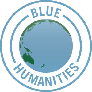
As a treat and indulgence, at the end of last year I asked a local Short Beach graphic designer to help me create this Blue Humanities logo. What will I use it for? It’s hard to say. Will there be t-shirts, coffee mugs, or swim caps? Maybe I’ll put together a conference? A cocktail party? An open-water swim? Those things will be possible again someday, right?
The process of putting the design together has led me to a few thoughts, which I’ll share in these early days of the year.
The Pacific is the center of the world.
The easiest part of the design was choosing a perspectival view of our blue planet. If the image does nothing beyond reminding anyone who sees it of the size of the Pacific Ocean, it will do what I want it to do. The Pacific occupies roughly one-third of the planet’s total surface area, more than all the land masses combined, When I look at that vast blue space framed by the tentative fingers of Asia, Australia, and the Americas, my personal Anglo-American and Atlantic background put me in a difficult position to make sense of a global blue humanities. I want this Pacific-forward image to remind and challenge me to think beyond what I know.
It’s hard to be both global and anti-imperial.
Earlier drafts of the image had the two words sprawled out across the oceanic blue, showing in their letterforms just a hint of the planet’s curving surface. In the end I thought writing on the water looked too imperialist, too much a reminder of fantasies of “conquering the oceans” that I want to move past. I don’t have any illusions about the ocean’s histories of conquest, slavery, piracy, and other forms of violence. But I am hoping to encourage ideas about plurality, fluid motion, circulation, and exchange. “Wet globalization” contains many stories, and I hope it can create new ones also.
Words fit awkwardly onto watery spaces.
That said, the design I ended up with, with the phrase “blue humanities” encircling the watery globe, still carries a whiff of domination that makes me uneasy. I don’t want the blue humanities to be a language of conquest! I’d also rather not create too much uniformity — but I didn’t think I could pull off a design that also flashed out alternative phrases like “hydrocriticism,” “ocean studies,” or “thallassography”!
“Meditation and water are wedded for ever.”
What I enjoy about this logo, and what I hope I’ll keep enjoying as I play with and deploy it, is its spur to the imagination. I’m a language-focused thinker. I don’t draw or play music, and in truth I don’t even watch movies or Netflix very much. My thinking is mostly about and with and in words, sometimes as academic arguments with footnotes and bibliographies, sometimes as dashed-off blog posts or tweets, increasingly in this year of pandemic isolation as short poems. What I want from this image of the world’s water is a new object to help me think about our oceanic planet. I’m looking at it now and thinking about what it shows and also what it excludes — the swirling water vapor in the atmosphere, the water inside living bodies, the massive subterranean caches beneath the planet’s crust. There’s a lot of water in this image, and a lot of water that’s not represented.
More blue humanities posts to come in 2021!